Thesis Motion Design
Immersive Form
Creating Form that is meant to be seen from every angle.
As virtual reality has begun to leave the realm of academic research and enter the forefront of popular culture, the opportunity has arisen to immerse the viewer in a world of the designers choosing. Virtual reality now allows the artist to take the viewer beyond windows, screens, and print and immerse them in a world of real time simulation and interaction.
Due to the development of new technologies and widespread commercial availability, the boundaries of stereoscopic three dimensional artistry are beginning to be redefined. Although in its infancy, virtual reality is promoting an indirect conversation between developers and viewers through experimentation with narrative and form. Immersive environments have now become a new form of consumable content. Entering into this conversation, I hope to develop and exploit form by referencing historical designers work, allowing for a new experience of their work and deeper investigation of form through immersive environments.
HISTORY
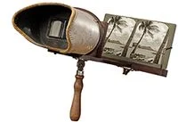
Virtual Reality and Immersive environments can trace their lineage back to the advent of Stereoscopic imagery in the 1830's. This was the year that Sir Charles Wheatsone took two images that were slightly different from one another, placed them on either side of two angled mirrors and is credited with first demonstrating binocular depth perception (Bendis). Since, Stereoscopy has been through a roller coaster of interest, coming into favor and popularity with the approval of the wheatstone viewer by the queen of england, To today where company's like oculus and google are attempting to push stereoscopic imagery to its limits.
Stereoscopy is a unique trait that allows us to see and understand the depth of the world around us. How this is done relies heavily on the fact that "we have two eyes, which are approximately 3 inches apart" (Gurman). Since our eyes are in two different areas on our head, each eye sees the world slightly different from one another; hence why when you close one eye, then the other, the picture you see slightly moves. Our brains "understand these differences and uses them to calculate distance creating our sense of depth and ability to gauge distance" (Gurman).
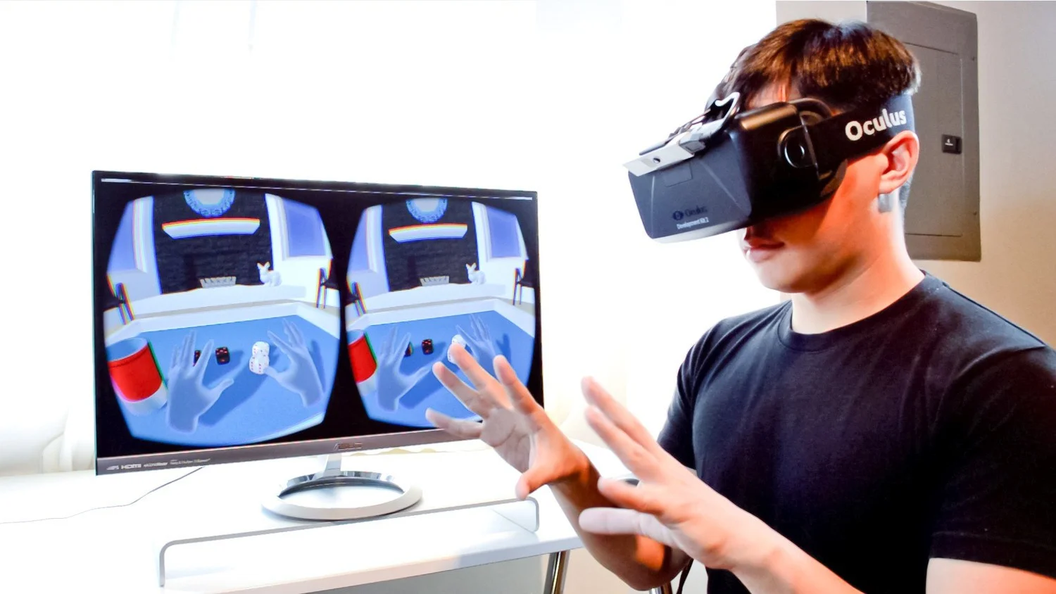
In the end, three dimensional imagery is a way to trick the brain into seeing depth in two dimensional images by controlling what each eye sees to fake binocular depth perception. This is at the core of all virtual reality headsets and (along with gyroscopic motion) play a large roll in immersing the viewer into the world that the designer has created.
CURRENT TRENDS
(as of mid 2016)
With company's such as Oculus, Google, HTC and Facebook all testing the waters, there seems to be a resurgance of interest in the possibilities of Virtual reality as a main content source. The quick rise of interest over the past year (2016) has seen virtual reality in the context of demonstrational content or as a "gimick" for popular culture to use in as a product driving stunt. However this belies the vast network of content and work that has been developed in a virtual wild west of design, technology and film.
the speed in which head mounted displays have been developed, like that of Oculus and HTC, has gave way to a catalogue of demonstration based “games” or promotional material for popular culture. These can only really be categorized as various experimentations with the virtual reality landscape and what could be done with the technology in the future. however, with the price and the technological knowledge needed to work such devices, it has left many interested consumers to buy second rate virtual reality substitutes.
While the Google Cardboard is by no means second rate and has a vast catalogue of interesting material, the more readily available “Immersive content” are 360 videos on services like Facebook and YouTube. These videos, while not true immersive content, give an interesting look into the trends that Virtual Reality is experiencing today. These videos are primarily promotional in nature, either as an extension of a films branding and commercial success or as a unique interesting music video concept. But as a microcosm of virtual reality, 360 videos allow for quick access to the general public to troubleshoot concepts before integration with more advanced Head Mounted Display systems.
ISSUES
Up until recently, the main focus for virtual reality companies was centered around technological advancements to give proof that head mounted display could feel natural and combat what has become known as “Virtual Reality Sickness” (an equilibrium imbalance due to lagging content material in the view screens, much akin to motion sickness). However the technology, while still needs some work, is essentially ready for consumer markets. Now it needs interesting new and engaging content to go along with its hardware. This has presented a slew of design and animation issues that have opened up a whole new way of thinking about how to do either one.
The first of these issues centers around Narrative. Traditionally the director has had full control over what the viewer sees, allowing them to compose and direct the viewer directly to what is important and interesting within a work. However, with Virtual reality, the camera is completely turned over to the viewer who can look anywhere within the space the they would like. For a linear narrative this has can be a potential downfall, for if the viewer doesn’t see a key point within the story, then they are potentially lost for the rest of the experience. There have been many investigations into creating visual cues to attract the attention of the viewer to where they should be looking, but more investigations are needed until the experience is a smooth one.
The next issue is that of Engagement, and inviting participation within the scene. In many instances, people have been trained through media outlets like television and print and online content, that they only have to look straight ahead and everything important will happen there. This can lead to many people putting on a head mounted display and immediately not knowing that their movement in the scene is vital. There needs to be a more natural way to immerse the viewer into the world that immediately breaks the idea of how traditional media is viewed.
Finally, the last that issue I will talk about is that of Unique Form. It is in this issue that I have decided to focus my thesis. Form making has been an integral part to the design making process and making for virtual reality and immersive environments have followed a very similar path to that of narrative storytelling. While most experiences out today do create scenarios that could not happen in the real world, most of them are grounded to the traditional ideas of animation and flat based design. In a 360 environment, there should also be unique forms that take advantage of the space to not only create experiences that couldn’t happen in the real world, but form that could exist in the real world.
Possibly one of the best use cases for the confined mobility of VR and the best utilization of its limitations comes in the form of the playable Demo, Sightline. In sightline, the user is meant to play the game in a seated position and just look around. At no point does Sightline ever push the viewer to do anything at the game’s pace, but instead allows the viewer to drive the experience unknowingly themselves. Over time the very act of observing becomes the game itself, as the more you don’t look at something, the more it changes in your peripheral. There is no learning curve and opens the opportunity to any person’s entry-level into VR to understand its potential in minimal storytelling. Sightline is also a brilliant way of illustrating the physicality of VR, by easing the viewer into many experiences that take them out of their comfort zone without being to sharp or taking control away from the viewer. “The Chair distills Sightline’s ‘gaze-detection’ mechanic and presents a series of experiences which inspires shock, wonder, fear, terror and joy – all within a 5 minute time frame. The Chair has no traditional interactive mechanisms, that is you don’t need a gamepad to play this game. It’s also clever, subtle and intuitive enough not to have to resort to tutorials and telegraphing in order for the player to work their way through the experience.” -Paul James
PROCESS
initial experiments
quick experimentation to become familiar with workflow.
typography, shape, texture
DIRECT TRANSLATION
Research based on selected designer.
Artwork choose will be turned into a virtual sculptural work that takes into account all sides of the work and attempts to unify and add interest to all sides.
work to be presented through the use of google cardboard and sketchfab.
WORLD BUILDING
still looking at the work of the artist, attempting to make the work a more immersive space.
by choosing a perspective within the work, and then building around that perspective point.
work to be presented through the use of google cardboard and sketchfab
UNIQUE EXPERIENCE
referencing the previous two excersizes, begin to develop a personal work that follows the form and theory of the artist.
these will be emersive and animated environments.
designed for Oculus Rift and 3d video
INITIAL EXPERIMENTS
360 LISSITZKY
Geometric Form Exploration
While being an important and large contributor to the Suprematist group coming out of Russia around 1915, El Lissitzky's work was heavily influenced by geometric shapes that he used to illustrate complex political and ideological theories. He also believed in being an "Agent for Change" and "Goal-Oriented Creation" which led him to create works of art with a specific purpose in mind (MoMA collections).
Once having met and collaborated with Kazimir Malevich, who spearheaded the Suprematist movement, El Lissitzky "rejected the imitation of natural shapes and focused more on the creation of distinct, geometric forms" (design is history). This limitation, or framework of creation, eventually became labeled as "Prouns" and attempted to "combine architecture and three-dimensional space with traditional two-dimensional imagery" (Wolf).
"In the space allotted to me I have not conceived the four walls as retaining or protective walls, but as optic backcloths for the works of art. That is why I decided to dissolve the wall surfaces as such."
-El Lissitzky
El Lissitzky's work has always fascinated me in its use of depth and dimension to create unique spaces and works of art. Combined with his interest in architectural spaces, Lissitzky seemed to be a prime candidate to be translated into dimensional space.
For the Direct Translation phase the sculptural component centered around Lissitzky's painting "Postman." the geometric forms that composed the work were easily translated directly into a virtual environment, the issue became how to make the flat two dimensional work wrap around into the third dimension. By taking liberty with what I thought could be happening behind the forms, I felt like I achieved a unique form.
In the World Building phase, I chose to use three of Lissitzky's works "Globetrotter" "proun el" and "troublemaker" I hoped to create unique satalite worlds that can then be investigated seperately, allowing the viewer to hop from one world to another through annotational markers. This way of navigating the world allows the viewer to investigate the world and experience it from different vantage points. It also instills a sense of participation in the work that engages the viewer and asks them to investigate.
Moving on to the last phase for Lissitzky, the Unique Experience, I decided to take similar shapes and references from Lissitzky's work and attempt to construct a building around the viewer. The Viewer starts off by moving towards the center, where an elevators door opens and ushers the viewer inside. The abstract building is then constructed around the viewer as they are transported up in the elevator itself. This experience was meant to illustrate Lissitzky's interest in form and architecture, while also experimenting with objects coming close to and moving away from the viewer. I wanted it to feel slightly dangerous and chaotic.
Download the oculus Rift File Here:
Download the oculus Rift File Here:
360 KANDINSKY
Organic Form Exploration
In contrast to Lissitzky's geometric rigidity, Wassily Kandinsky had a more free and organic expression in his work. This made for an interesting contrast while still being concerned with similar forms. above all else, Kandinsky held painting hand in hand with spirituality. "He sought to convey profound spirituality and depth of human emotion through a universal visual language of abstract forms and colors that transcended cultural and physical boundaries" (griffin, The art story).
"The true work of art is born from the 'artist': a mysterious, enigmatic, and mystical creation. It detaches itself from him, it acquires an autonomous life, becomes a personality, an independent subject, animated with a spiritual breath, the living subject of a real existence of being."
-Wassily Kandinsky
When developing the Direct Translation for Kandinsky, I chose his work "Dominant Curve." The composition was meant to investigate color and transparency through the forms to create organic shapes. I originally landed on this particular painting when visiting the Guggenheim Museum in New York, and getting to view the large scale painting in person. Already being a fan of Kandinsky's paintings, I was fascinated with this painting in general when viewing the original in person. Immediately my mind began to think of the painting in three dimensions, with its overlapping shapes and complexity of form and color. This thought process then led to questions about what the sides, back and depth of the shapes would be in a three dimensional space.
Using kandinsky's work, "Yellow-Red-Blue" for the World Building phase, I decided to try to play off the recognizable abstract shapes within the painting itself. I wanted to position the viewer inside of the mind of the figure's head and allow them to investigate the work from a position of thought. the world was then constructed around this point. The main difference and difficulty with this piece was the construction. What I noticed was that situating a fixed position and developing the world around it led to many parts of the composition getting in the way of other objects and thus obscuring the overall experience of the work. I realized I needed to start from a flexible position and build up and not out, by taking more advantage of height and less about distance from the viewer.
Taking what I had learned from all of the previous phases, I set to work building out shapes for the final Unique Experience. In this world I wanted to attempt to make fluid and organic shapes while also making the movements sweeping and organic as well. I also wanted to incorporate a typographic element to the work. I felt that his was important as an investigation into the earlier issues of typography in a 360 immersive environment. It also gave a way to utilize the type base "initial experiments" in a more environmental way. Over the course of the viewers journey, I wanted to instill a physical sense to the work by orbiting the viewer around and up in the scene. This allowed for a more interesting way of travel then the straight lines of the "Lissitzky" piece.
CONCLUSIONS
Through the process of this project I have a deep respect for the science, technology, design and dedication needed to involve oneself in Virtual Reality and Immersive Environments. This project has tested me and my abilities to their breaking point and in the end I feel as though my skills in developing for VR and my skills as a 3D designer have strengthened greatly. My background in Cinema 4D was a great help in wrapping my mind around the complexities for VR, however the lack of an existing pipeline (at the time) and my own inexperience the program Unity (This was the first time I had ever worked in a program like Unity) proved to be the greatest hurdle to get over. I had to develop my own methods of creating in Cinema 4D and forcing the design to work in unity and then, by process, in VR. A very large part of the project was figuring out how to develop my own way of creating a VR world with cinema 4D. I believe I have a long way to go and a lot of work ahead of me, however I have found a true love in the technology and potential of VR systems. I plan to continue this project, developing a methodology that eventually leads to my own unique work and my own unique process. In the future I hope to be involved with companies and institutions that are interested in pushing design boundaries for this new landscape in Motion Graphics.
THANK YOU
Mark Kulakoff - Thesis Advisor
Brad Tucker- Adv. Motion
Micheal Scroggins- Stereoscopics
Donnovan Keith- C4D help
The CalArts MoGraph team
The Crying Club
My Parents and Family
BIBLIOGRAPHY
Bendis, Jared E. A History and Future of Stereoscopy in Educatio. Instructional Technology & Academic Computing Case Western Reserve University. 2011
Wolf, Justin. The Art Story, Modern Art Insight. El Lissitzky, Russian Painter, Typographer, and Designer. http://www.theartstory.org/artist-lissitzky-el.htm. The Art Story Contributors. 2016
Design is History. El Lissitzky. http://www.designishistory.com/1920/el-lissitzky/. Indexhibit. 2016
Griffin, Eve. The Art Story, Modern Art Insight. Wassily Kandinsky, Russian Painter. http://www.theartstory.org/artist-kandinsky-wassily.htm. The Art Story Contributors. 2016
Gurman. Joseph. Stereo Learning Center. Nasa, Stereo Observatory. http://stereo.gsfc.nasa.gov/classroom/how.shtml. 2012
Betancourt, Michael. The History of Motion Graphics. Wideside Press. Savannah College of art and design. 2013
James, Paul. “Why ‘Sightline: The Chair’ on the DK2 is My New VR Reference Demo” https://www.roadtovr.com/sightline-the-chair-oculus-rift-dk2-vr-reference-demo/ 2014

